LUXURY DECODED: What the Most Important Shoes of 2026 Are Really Telling You- Part 1
Images via FashionNetwork, Dior and Loewe
They say the first thing people notice is your face and your shoes. Everything in between is just context.
There is something psychologically precise about that observation. The face communicates who you are. The shoes communicate who you have decided to be.
Footwear has been fashion's most coded accessory since antiquity. Egyptian pharaohs wore sandals that signalled divine status through material and elevation. Venetian noblewomen wore chopines so extreme they required servants to walk.
And in luxury fashion where every decision is intentional, every detail is considered, the shoe is arguably the most honest object a house produces.
Each transition is not just a personnel change. It is a complete re-negotiation of what a house believes, what it wants to say, and who it is speaking to. And nowhere does that re-negotiation become more legible than in footwear.
A bag silhouette can be iterated slowly. A shoe collection has to answer the question immediately: what is this house's relationship with the body, with craft, with desire, with status?
And what the most significant collections of 2026 are revealing is a set of deeply distinct philosophies, each house making a different argument about what luxury is, what it's for, and who deserves to understand it.
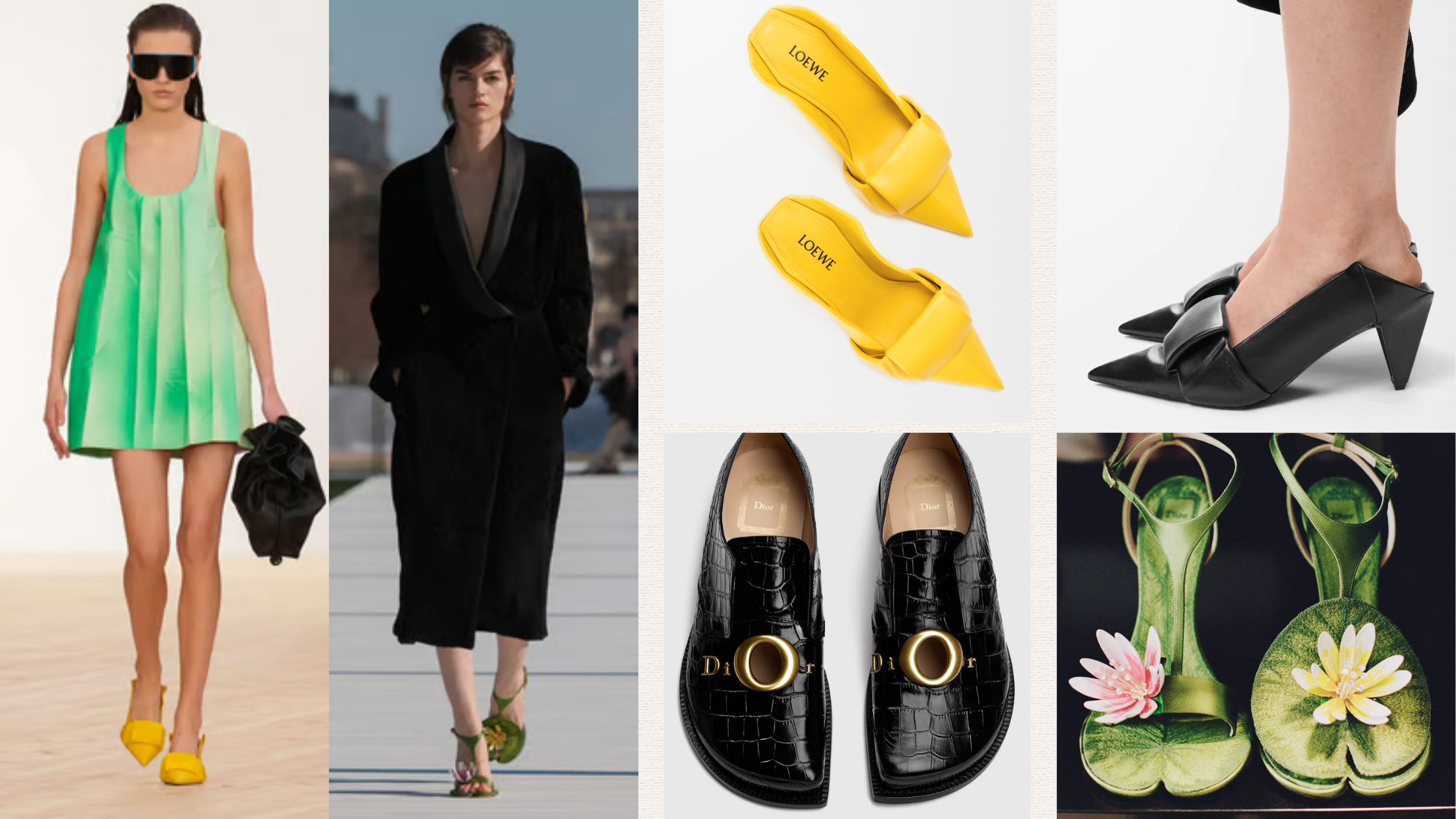
In Part 1 of our analysis, we decode the footwear of two houses at the centre of the biggest creative transition in luxury right now: Loewe and Dior.
Case Study 01
LOEWE: Two Founders Walk Into a Heritage House
McCollough and Hernandez arrive at Loewe as founders themselves, which changes everything about how you read their first collection. Their debut show notes say it plainly: to enter Loewe is to take on codes shaped over 180 years of history, defined above all by an enduring commitment to craft and its Spanish identity.
The footwear from their debut is where that philosophy becomes most legible.
Images via Loewe
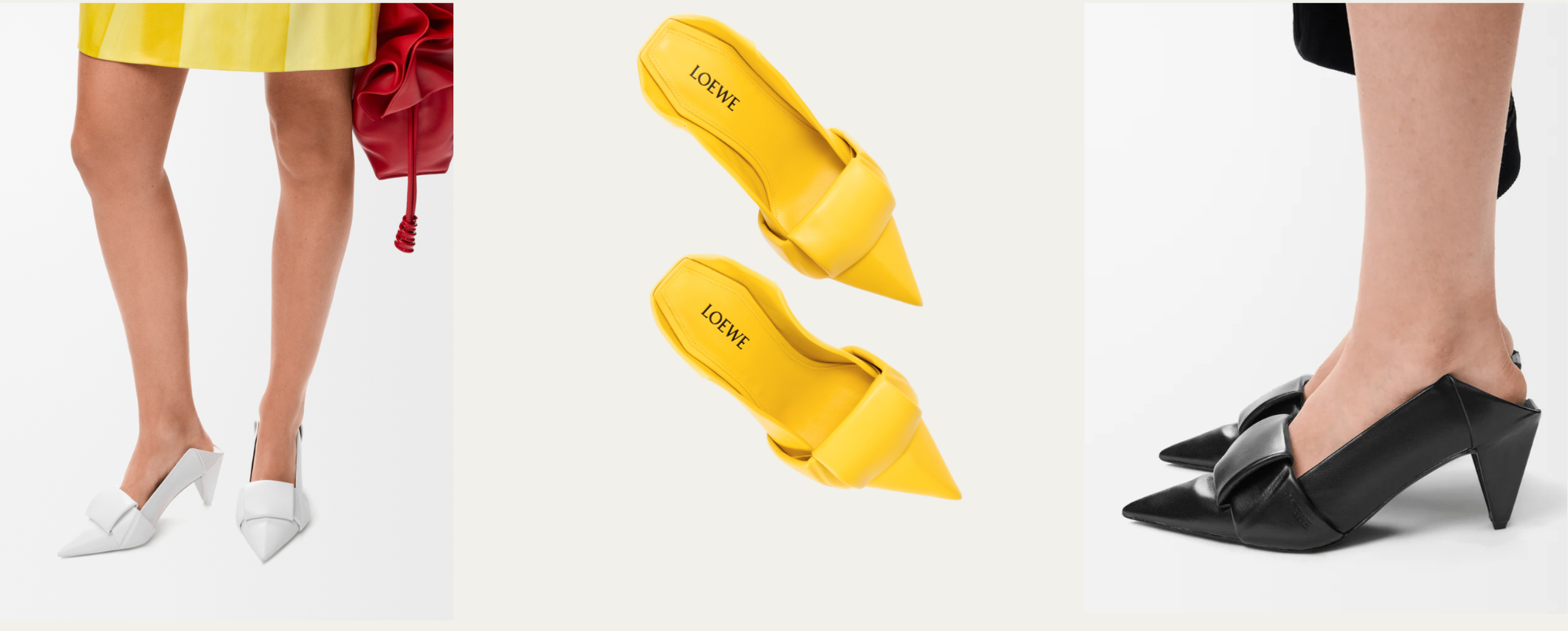
Orisé Atelier's standout from the entire collection is the Origami Flap Back Pump in Lambskin. The folded flap at the toe is not decorative origami vocabulary applied to a conventional shoe. The fold is structural. It is the visual anchor around which the entire design organises itself.
The heel is a perfect geometric cone that doesn't merely echo the angularity of the folds but rhymes with it, the way a recurring motif rhymes in poetry. Every element refers back to every other element. Everything is internally consistent. The result is a shoe that photographs almost like sculpture, because it essentially is: an object that has resolved its own internal logic so completely that it has become self-contained.
McCollough and Hernandez are signalling from their very first collection that they intend to keep Loewe in the business of the shoe as resolved object. This will outsell everything else in the collection.
Images via Loewe
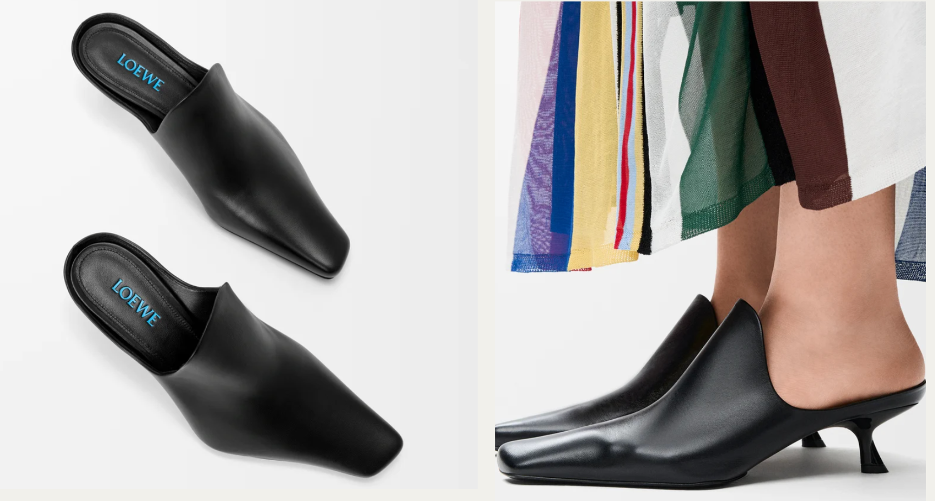
The Emily Mule in Lambskin works from the same philosophy but through opposite means. Where the Origami pump announces its conceptual intention immediately, the Emily withholds. The upper is a deep, clean scoop with no seams and no ornamentation. The heel is a thin curved spike that tapers and then flares at the base, insect-like, almost anatomical, signalling architectural intelligence without performing it. The whole shoe is a study in negative space: what remains when you strip a shoe down to its purest architectural intention? The answer is a silhouette so specific and so resolved that it requires no explanation. That silence is not minimalism for minimalism's sake. It is design confidence, the same confidence that built Proenza Schouler's reputation and is now being deployed inside a 180-year-old house.
Images via FashionNetwork and Loewe
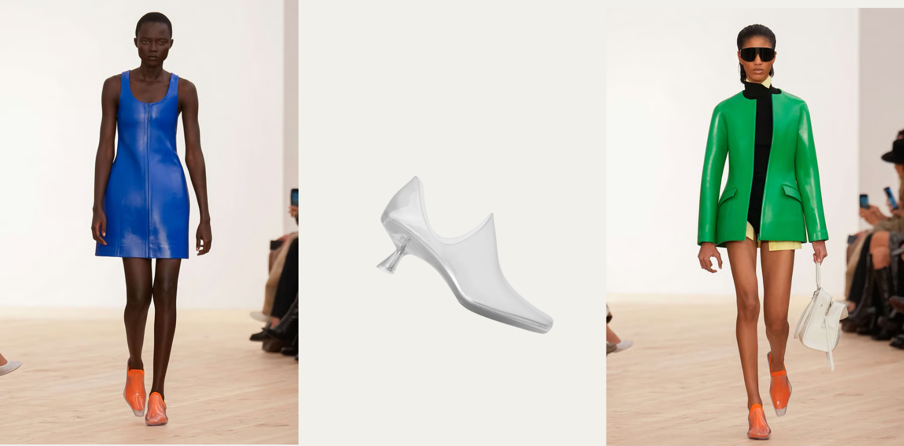
The Emily Aqua Bootie in PVC is the collection's most culturally agile move. Transparent PVC, sold with a three-pack of coloured socks in red, orange, and cobalt blue. The shoe is literally a vessel, and the sock becomes the colour of the shoe each time it is worn. The consumer is co-designing the object every time they dress. Transparent shoes carry a long cultural charge: the Cinderella archetype, club culture, early 2000s nostalgia. McCollough and Hernandez are borrowing that charge without being explicit about it. Same heel DNA as the Emily mule. Completely different cultural register. This was the piece that circulated most widely on social media from the debut and it will convert a new customer who was never in Loewe's orbit before.
Case Study 02
DIOR: Archaeology as Creative Direction
Jonathan Anderson at Loewe had over a decade to build his own design language from scratch. At Dior he is inheriting one of the most codified visual identities in luxury: the J'Adior ribbon, the Oblique canvas, the CD hardware, the Dior name embroidered on everything. The question is not what he is creating. The question is what he is choosing to keep, and why.
The answer across this collection is consistent. Anderson is not dismantling the house. He is archaeologising it, finding the original intentions and making them legible to a 2026 consumer.
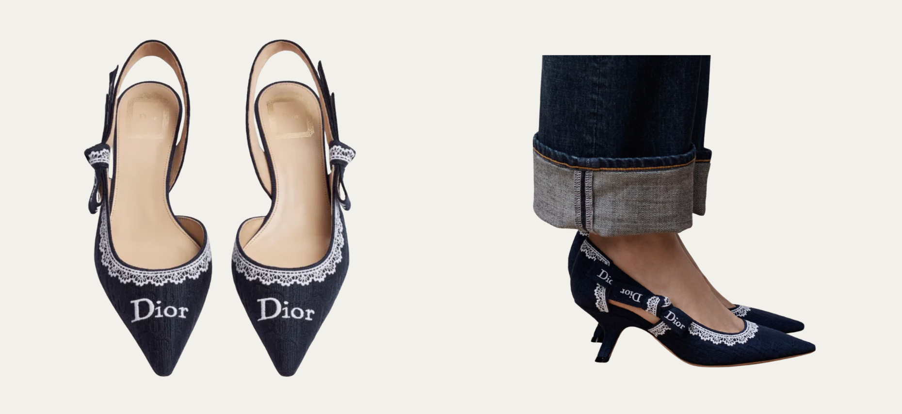
Images via Dior
The J'Adior Slingback Court Shoe is the first proof of that strategy and it is a fascinating power move. The J'Adior slingback was Maria Grazia Chiuri's signature piece, the shoe that became a cultural symbol through a decade of celebrity ubiquity. Anderson keeping it is a deliberate act of institutional respect. But the execution is his: Oblique canvas as expected, white lace trim inserted. Lace at Dior goes back to the earliest couture ateliers. It is a direct archive pull. He is layering his own archival reference over a silhouette the entire fashion world associates with his predecessor. He is not erasing the past. He is adding a layer.
Images via Dior